We are pleased to announce the launch of our new brand identity – new logo and website with refined messaging. This is a significant milestone in our journey. The website is part of our on-going evolution to stay ahead of the curve and embrace technological revolution to serve clients better.
Our updated website and messaging enable our clients to gain a deeper understanding of our Quality Engineering, Quality Assurance, Digital Transformation Assurance, Gen AI application testing, AI testing and Software Product Engineering capabilities. Additionally, it enables us to effectively communicate our success stories, our thought leadership in tech space, and how we are building a people-centric culture.
The website also communicates our vision to use people and technology to drive digital change. To achieve this vision, we are providing exceptional digital transformation services to our clients adding value to their businesses and providing advancement opportunities to our people.
Our journey so far
Enhops, a ProArch Company was established in 2015 with an objective to provide quality engineering solutions to enterprises across the globe. As an organization, Enhops has always been customer-centric and empowered our clients to integrate Quality Engineering into their digital transformation programs.
Through our parent company, we also bring strong Software Product Engineering capabilities with a vision to help clients in building world-class applications. This practice combines data, cloud, next-generation, security solutions, and managed services to drive business transformations.
Today, Enhops is growing at a tremendous pace – our Enhops family consists of passionate and talented technologists. We have a growing client portfolio that we are proud to work with. Building on our strength as an human-centric company, we are enabling enterprise-level customers to accelerate their quality engineering and product engineering initiatives towards business transformation. We are constantly evolving to serve our clients in a better way and delivering value-based outcomes.
The New Logo and Brand – The Thinking Process
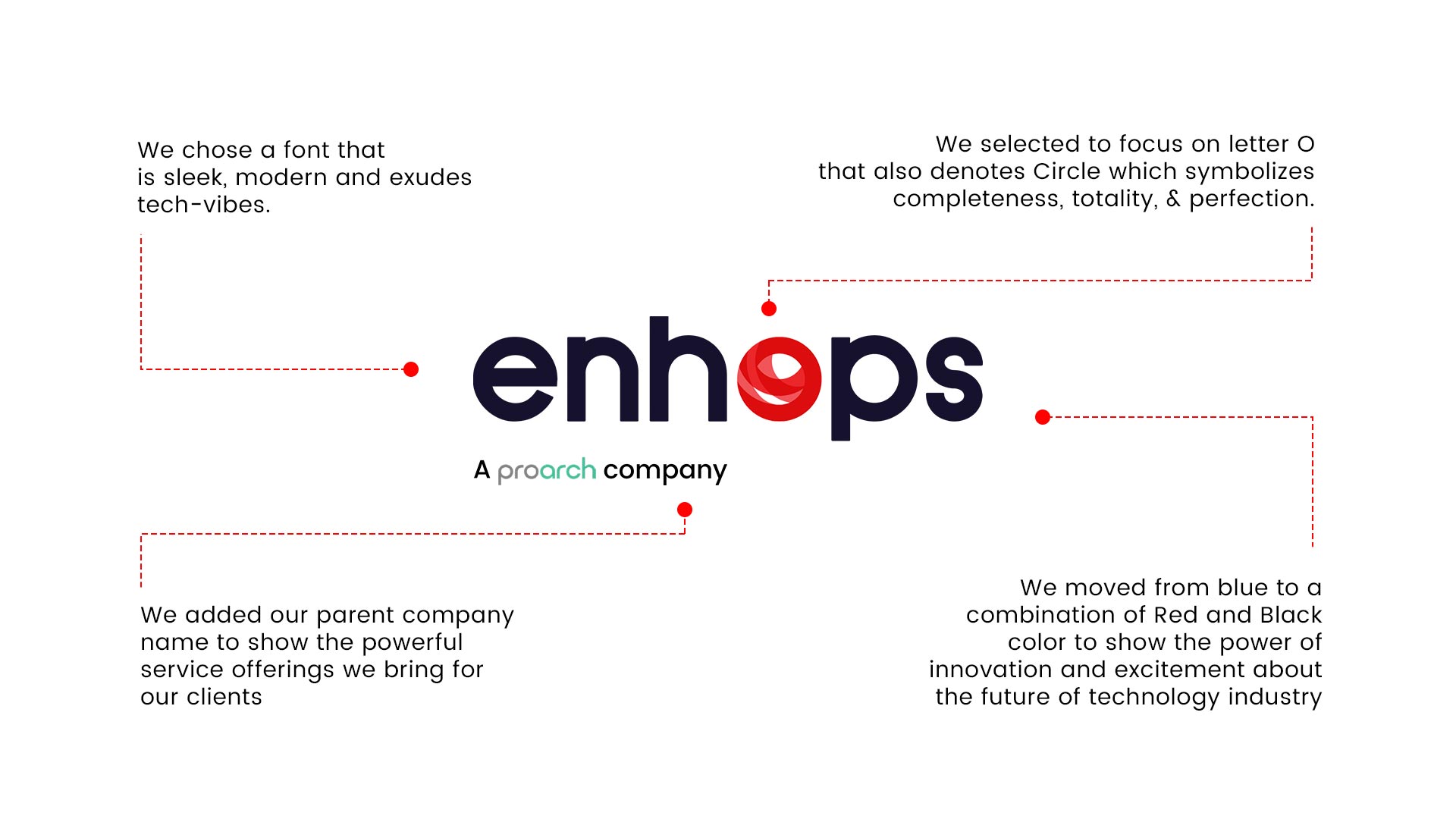
Our name originates from the phrase Enhancing Operations. We wanted a modern spin on it. We made our logo simple and easily recognizable, something that triggers brand recollection easily.
Our wordmark is a geometric sans serif font that gives modern and tech-centric vibes. Our icon, on the other hand, is bright and youthful. The red color is symbolic of innovation and excitement about the future of technology. It connotes global, technologically advanced, and constantly evolving. The icon O also symbolizes Circle, that means Completeness, Totality, and Perfection. We derived our inspiration from globe or earth that has dynamic nature of moving continuously and thus it naturally keeps evolving.
Our updated messaging reflects that Quality Engineering and Software Product Engineering will be at the forefront of our capabilities. Having worked with emerging technologies and methodologies across various verticals and geographies, we can help enterprises drive their business transformation plans with an outcomes-based approach. Our service offerings are:
- Advisory & Consulting
- Quality Assurance
- Quality Engineering Strategy
- Digital Transformation Assurance
- Software Product Engineering
- Gen AI Application Evaluation
- AI-driven Testing
If you want to know more about each one of them in depth, please explore our newly designed website or get in touch with us at marketing@enhops.com.
Our new identity only means that we are getting better at everything – more customer-centricity, more employee-centricity, innovation at scale, and building more meaningful partnerships. We are incredibly proud of the work that we do at Enhops and thankful to our passionate team, partners, and clients that have made this growth possible. We owe this new brand identity to all of you.
If you have any questions, please don’t hesitate to reach out! Until then, keep an eye on Enhops as we continue our growth towards becoming a full-fledged Quality Engineering and Software Product Engineering partner.
